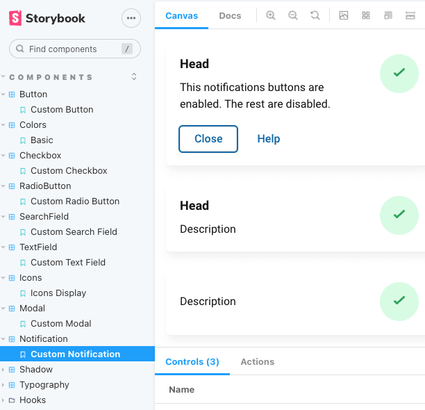
What is it?
This is a Storybook of reusable components such as buttons, inputs, typography, div styles, etc. This UI Kit is built with React, CSS, and Typescript. I have built out two versions alongside each other: one with Tailwind CSS and the other with Vanilla CSS. This exercise is done in my freetime to keep my CSS skills sharp and to demonstrate my understanding of a modern and professional UI development to perspective employers. Please give Chromatic a moment to load; Chromatic can be slow for non-enterprise pages. Refresh if Storybook does not load.
